Designing for Gen Z: Key Expectations and UX Guidelines
When designing digital experiences for Gen Z, it’s crucial to look beyond the stereotypical view of this generation as social media obsessed.

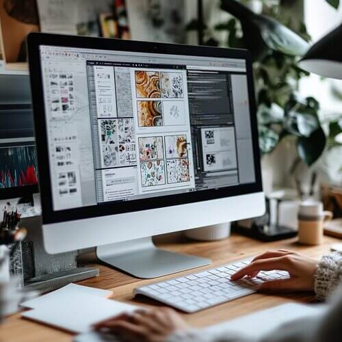
Contrast in web design goes beyond simply making elements stand out, it’s a fundamental design principle that enhances visual appeal while maintaining functionality.

Written By Daena King
Feb 2025 / Reading Length: 6 minutes
Design Enhances Your Website’s Impact, make your website more accessible, readable, and visually engaging by mastering contrast.
Contrast in web design goes beyond simply making elements stand out, it’s a fundamental design principle that enhances visual appeal while maintaining functionality. A well-contrasted site ensures clarity, guiding users through content effortlessly and improving their experience.
Without proper contrast, visitors may struggle with readability, leading to frustration and potential drop-offs. By strategically applying contrast, you can boost accessibility and increase engagement. Let’s explore how contrast can elevate your web design.
Contrast refers to the visual differences between elements like colour, size, and shape. It involves deliberately placing opposites to highlight distinctions and create a structured visual hierarchy. Effective contrast allows users to navigate your site with ease, identifying key information at a glance.
For instance, high contrast between text and background, such as black text on a white background improves readability. Similarly, varying size and colour can emphasise important elements like call-to-action (CTA) buttons and headings.
Contrast plays a crucial role in shaping user experience. Here’s why it’s essential:
Contrast can take various forms, each contributing to a better user experience. Here are six fundamental types:
To maximise the benefits of contrast, consider these design strategies:
Identify Key Elements to Highlight
Not everything on your website needs to stand out. Prioritise essential components like CTA buttons, headlines, and contact forms. Use contrast to subtly guide visitors toward these key areas, making them more likely to take action.
Maintain Consistency
Contrast should align with your site’s overall aesthetic to ensure cohesion. Stick to a defined colour scheme and typography hierarchy. For example, if your design relies on dark backgrounds with white text, keep this consistent across your pages to enhance readability and brand identity.
Balance Addition and Subtraction
Contrast isn’t just about adding bold elements, it’s also about knowing when to remove excess details. Simplifying your design by eliminating unnecessary images or text can create a cleaner, more focused layout.
Use Layers to Add Depth
Layering elements such as shadows, overlays, and gradients can create a sense of depth, enhancing contrast without overwhelming the design. For instance, a semi-transparent dark overlay behind white text ensures readability while preserving background visuals.
Test and Optimise
What looks great in theory may not always work in practice. Conduct usability testing or leverage web analytics tools like heat maps and A/B testing to see how users interact with your design. Adjust contrast elements based on performance insights to optimise user engagement.
Contrast is a powerful tool in web design, helping you create visually striking and highly functional websites. With Web flow’s visual design tools, you can effortlessly implement contrast principles to craft a compelling digital experience.
Web flow gives you complete creative control, allowing you to build, refine, and customise your site without limitations. Explore pre-designed templates or design from scratch to bring your unique vision to life.
When designing digital experiences for Gen Z, it’s crucial to look beyond the stereotypical view of this generation as social media obsessed.
Micro animations are simple, small, functional animations which provide visual feedback and help users see changes on websites displayed more clearly.
Are you ready to uncover the most exciting web design trends for 2025? From voice search to sustainable practices, the future of web design is immersive, interactive, and powered by AI.