Understanding Google’s Helpful Content Update
The Google Helpful Content update focuses on what content that is more relevant and helpful to users rather than content that is designed for search engines.

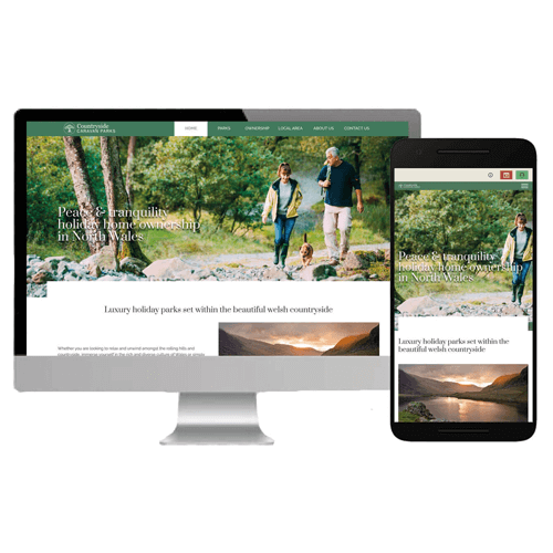
Most people want a website that looks great and performs well on all devices. After all, why would someone want to visit a website that looks terrible on their phone or tablet?

Written By Andy Hodson
Jan 2025 / Reading Length: 6 minutes
In today’s digital world, having a website that looks great and functions well on all devices is essential. Nobody wants to visit a site that appears distorted or difficult to navigate on their phone or tablet.
However, designing a responsive website can be challenging if you’re unsure where to begin. In this guide, we’ll share key tips on ensuring your website looks fantastic across all screen sizes and devices.
A responsive website automatically adjusts its layout and content to fit the screen size of the device being used whether it’s a desktop, laptop, tablet, or smartphone.
This approach ensures a seamless user experience without requiring separate versions of the site for different devices, which would be costly and time-consuming to maintain.
Responsive web design relies on HTML and CSS media queries to create flexible grids, layouts, and images. Developers design these elements to dynamically adapt, ensuring an optimal experience for all users.
1. Flexible Grid Layouts
A responsive website should be built using a fluid grid system, allowing elements to resize proportionally rather than at fixed widths.
2. Optimised Images
Images should be adaptable to different screen sizes. A large banner that looks great on a desktop may not work well on a mobile screen. Using breakpoints to adjust image cropping and focus ensures a high-quality visual experience on all devices.
3. Mobile-Friendly Navigation
Menus should be easy to use on smaller screens. A collapsed ‘hamburger’ menu is a popular choice for mobile-friendly navigation.
4. Readable Text and Scalable Fonts
Font sizes should be legible on all screens without requiring zooming. Avoid small text that’s difficult to read on mobile devices.
5. Fast Loading Speed
A responsive site should load quickly across all devices. Optimising images, minifying CSS/JavaScript, and using caching techniques can enhance speed and performance.
1. Mobile Usage is Dominant
As of November 2022, 59.5% of all website traffic comes from mobile users. If your website isn’t responsive, you risk alienating a significant portion of your audience.
2. Improved SEO Ranking
Google’s mobile-first indexing prioritises mobile-friendly websites in search results. A responsive design enhances your site’s SEO, helping it rank higher.
3. Consistent User Experience
A seamless and visually appealing website builds trust and engagement. Users are more likely to stay and explore if the experience is smooth across devices.
4. Easier Site Management
A single responsive website is easier to maintain than separate desktop and mobile versions. It simplifies updates and reduces overall costs.
While there are numerous benefits, there are a few challenges to consider:

If you aim to improve SEO, enhance user experience, and future-proof your website, then responsive design is a must.
However, if your site is for a very specific audience that only uses desktops, a simpler fixed-width design may suffice.
Regardless of your choice, prioritising user-friendliness and accessibility should always be the main goal.
A sleek, mobile-friendly, and fast-loading website is essential for success in today’s digital landscape. Responsive design ensures your content is accessible and visually appealing across all devices, eliminating the need for multiple site versions.
While having a responsive website is just the beginning, maintaining high-quality content, products, and services will further enhance your online presence.
Your website is the digital face of your business make it as engaging, accessible, and flexible as possible to achieve the best results.
The Google Helpful Content update focuses on what content that is more relevant and helpful to users rather than content that is designed for search engines.
As technology evolves, so does website design. To keep up with the latest trends and technologies, it’s important to stay ahead of the curve.
Have you ever wondered how the really successful websites become so successful?